Building a Brand Style Guide That Actually Works
A practical walkthrough of creating comprehensive brand guidelines that teams actually use—covering typography, color systems, imagery direction, and tone of voice standards.

Why Your Brand Needs Clear Guidelines
Here’s the reality: you can spend months designing the perfect logo, choosing the right colors, and creating beautiful marketing materials. But if you don’t document how these elements work together, chaos follows. Your marketing team uses the logo one way, social media uses it another way, and by the time your brand appears in print, it doesn’t look like your brand anymore.
A solid brand style guide isn’t just a document gathering dust on a shelf. It’s a living reference that keeps everyone—designers, copywriters, developers, clients—on the same page. We’re talking about consistency that actually builds recognition.

Typography: Your Brand’s Voice in Type
Typography is one of the easiest things to get wrong—and one of the most impactful. You’ll want to specify exactly which fonts you’re using, at what sizes, and for what purpose. Don’t just say “use Helvetica.” Instead, document it like this:
Primary Heading Font
Font: Montserrat Bold, 32px for main titles, 24px for subheadings
Use: Page titles, section headers, marketing materials
Line height: 1.3 for readability
This specificity matters. It’s the difference between a brand that looks intentional and one that looks like someone threw together whatever fonts were available. We’ve found that brands with 2-3 complementary fonts work better than those with five or six. Simplicity wins.

Educational Information
This guide provides foundational principles for creating brand documentation. While the techniques and approaches are widely used in the design industry, specific implementation should be adapted to your unique business context. Brand guidelines work best when they’re reviewed regularly and updated as your brand evolves. Consider consulting with experienced brand strategists or designers for customized guidance specific to your organization.
Color Systems: More Than Just Pretty Hues
Your color palette is like your brand’s mood ring. It tells people how to feel about what you do. But here’s what we see happen all the time: brands choose colors without thinking about how they’ll work across different applications. That vibrant teal looks great on a website, but does it work on a business card? Can you read white text on it?
Document your colors in multiple formats. You’ll need hex codes for digital, CMYK for print, and RGB for video. And don’t forget about accessibility. Make sure your primary text color has at least a 4.5:1 contrast ratio against your background. That’s not optional—it’s essential for readability.
Primary Color: #2D6A4F (use for buttons, links, main CTAs)
Secondary Color: #D4A574 (use for accents, highlights)
Text Color: #1B3A1A (ensure minimum 4.5:1 contrast)


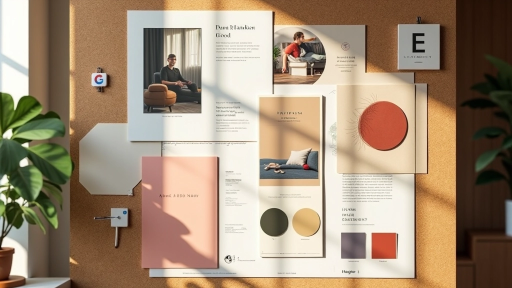
Imagery Direction: Creating Visual Consistency
Your photos and illustrations need to tell the same story as your copy. If you’re using bright, energetic lifestyle photography, but your copywriting is serious and corporate, something’s off. The visual language needs to match the verbal one.
Specify things like: Are you using photography or illustrations? If photography, what’s the style—documentary, styled, candid? What about lighting and color treatment? Should images be heavily edited or more natural? What about composition? Do people look at the camera or away? These details seem small, but they compound across dozens of assets.
We typically recommend creating a 4-6 image mood board showing exactly the style you want. This visual reference is worth more than pages of description. When a freelancer or team member needs to source imagery, they can see immediately whether something fits or not.
Tone of Voice: Your Brand’s Personality in Words
A lot of brands skip this part, and it shows. Your copywriting should sound consistent whether it’s on your website, social media, or customer support emails. Are you formal or conversational? Professional or playful? Do you use industry jargon or explain things simply?
Document this with actual examples. Show what you’d write and what you wouldn’t. For instance: “We don’t say ‘utilize our services.’ We say ‘work with us.'” That’s the kind of specificity that matters when you’ve got multiple people writing on behalf of your brand.
Our Tone
“We’re here to help you build something great.”
Not Our Tone
“We facilitate the optimization of your strategic initiatives.”
Making Your Guide Actually Useful
Here’s what separates guides that get used from ones that don’t: accessibility and format. A 50-page PDF that only the brand manager has access to isn’t helpful. Your guide needs to be:
1
Easy to Find
Host it somewhere your team can access it. A shared Google Drive folder, a simple website, or a collaborative tool like Figma works better than email attachments.
2
Practical and Visual
Heavy on examples, light on theory. Show how the logo works with different backgrounds. Show color combinations that do and don’t work. Real examples beat abstract rules.
3
Living and Updated
Your brand evolves. Your guide should too. Set a schedule to review and update it—maybe every 12-18 months or whenever major changes happen.