Logo Design Fundamentals: From Concept to Execution
Learn the essential principles of logo creation—from understanding negative space to building memorable marks that work at any size.
Your brand shows up everywhere—social media, business cards, packaging, websites, billboards. But does it look like one unified brand, or like five different companies? We’ll show you how to keep your identity consistent and compelling across every medium.

Consistency isn’t just about looking polished—it’s about building trust. When someone sees your Instagram post, then visits your website, then picks up your business card, they should instantly recognize your brand. That recognition comes from visual coherence: the same color palette, typography, imagery style, and overall feel across every touchpoint.
In Malaysia’s competitive business landscape, where brands are fighting for attention across digital and physical spaces, this consistency becomes your secret weapon. Your customers see you dozens of times in dozens of places. Each time they see you, they’re either reinforcing their mental image of your brand—or getting confused by something that doesn’t match.

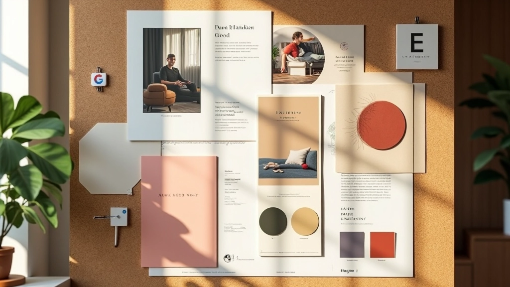
Your brand identity isn’t just your logo. It’s your color palette, typography, imagery style, spacing, tone of voice, and overall aesthetic. Every element needs to work together seamlessly—whether someone’s viewing your brand on a 5-inch phone screen or a 48-inch billboard.
Digital is where most of your audience encounters you first. Your website, social media, email newsletters, and app all need to feel like they’re part of the same brand family. Think of it like this—if your Instagram looks vibrant and playful but your website feels corporate and stiff, people get whiplash.
Here’s what consistency looks like in practice: Your Instagram grid uses your brand colors (let’s say emerald green and cream). Your website homepage uses the exact same green in the navigation bar and call-to-action buttons. Your email signature uses that same green for accent text. Your YouTube channel header features your brand’s distinctive photography style. Someone following you across these platforms doesn’t have to think—they instantly know it’s you.


Print materials are still powerful—maybe more powerful than ever, precisely because they’re less common now. A well-designed business card creates a different impression than an email. It’s physical. It lasts. Someone puts it in their wallet. They see it again weeks later.
But here’s where things get tricky. Print has constraints that digital doesn’t. Your monitor can display 16 million colors, but a printer might reproduce colors slightly differently. Your website has unlimited white space, but your business card has 2×3.5 inches. Your email newsletter can be any height, but a brochure has fixed page dimensions. These constraints actually force you to make better design decisions—you have to prioritize. What’s essential? What can be stripped away?
Here’s the thing—your digital and print identities don’t need to be identical. They need to be complementary. Think of it like a family resemblance. Siblings don’t look exactly alike, but you can tell they’re related.
Your website might feature bold, colorful imagery and animated interactions. Your business card might be minimal and elegant—one color, white space, a single strong visual. They’re different approaches, but they use the same core colors, the same typography family, and they convey the same brand personality. Someone experiencing both feels they’re from the same source.
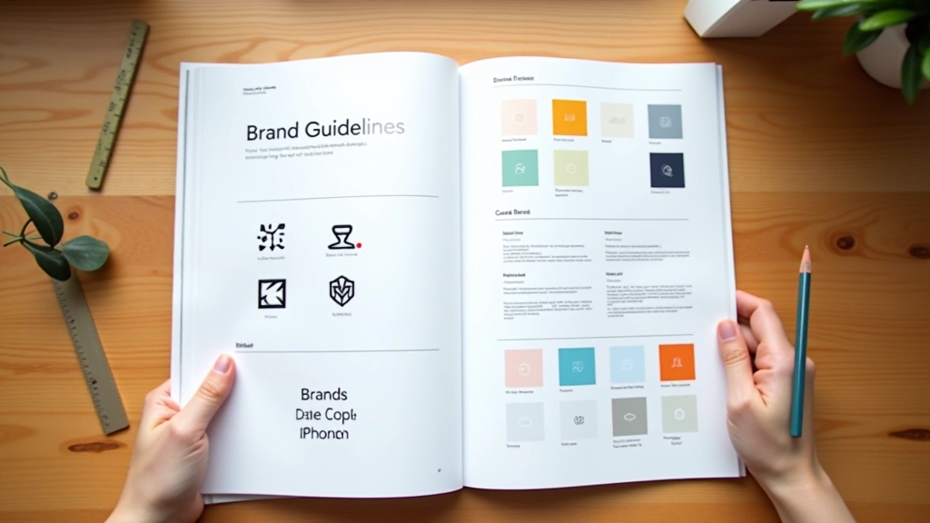
The bridge between these worlds is your brand guidelines document. This isn’t a luxury—it’s your reference manual. It documents your primary color (RGB for digital, CMYK for print), your typography hierarchy, your logo variations for different sizes and contexts, your imagery style, your spacing rules, and your tone of voice. When you’re designing something new, you check the guide. It keeps everything aligned.
This guide provides educational information about brand identity principles and best practices. Specific design outcomes depend on your unique brand, industry, target audience, and business goals. We recommend consulting with a professional brand designer or design agency to develop a comprehensive brand strategy tailored to your situation.
You don’t need to overhaul everything tomorrow. Start by auditing what you already have. Look at your current website, social media, business cards, and any printed materials. Where’s the inconsistency? Is your logo sized differently everywhere? Are your colors slightly off in some places? Does your tone of voice shift between your website copy and your social media captions?
Then prioritize. Which touchpoint gets the most attention from your audience? Start there. If you’re a digital-first business (like a software company), fix your website and app first. If you’re a brick-and-mortar business in Malaysia with a strong local presence, maybe your in-store experience and packaging deserve priority. Your resources are finite—use them where they matter most.
Finally, document everything. Create a simple brand guidelines document—it doesn’t need to be fancy. It can be a PDF with your logo usage rules, your color palette with hex codes and CMYK values, your font families, and a few examples of how your brand shows up in different contexts. Share it with anyone who creates content for your brand. This document becomes your north star.
Consistency across touchpoints isn’t just aesthetically pleasing—it’s strategic. When your brand looks and feels the same everywhere, people remember you. Recognition builds trust. Trust builds loyalty. And loyal customers buy more, refer more, and stick around longer.
In Malaysia’s growing digital marketplace, where businesses are competing for attention both online and offline, this unified approach gives you an edge. You’re not scattered. You’re not confusing. You’re clear, professional, and memorable. And that matters more than ever.